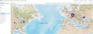
Distribution over time
I always wanted to visualize how the name Kemmler have spread out over the centuries. With this post I try to give it a shot.
In a first step I have selected all persons carrying the name Kemmler in all the known variants as Kemmler, Kaemmler – male and female – out of my ancestry database. As second criteria I took time slices of 50 years period between 1600 and 1900. At the point of the slice the person had to be alive to be selected and its place of birth has to be more precise than the country to provide reasonably goog geocoding results. Each of this time slice represents a separate data layer in the map. For the US data I have used the county georeference in case no city was given.
In the subsequent interactive map each layer can be selected or deselected individually allowing so an easy comparison between two-time slices. The map also allows zooming in and out.
With this Link you can directly access the map on ARCGIS Online.
At this point I have to stress that the data aren’t by far complete. They just represent the data in my main database as December 2015. I myself have a second database where I have stored Kemmler persons found on the internet but where I haven’t been able to verify of connect them to my main data.
